
Case Studies
A closer look at three projects from the mission log: what the client needed, how we approached it, and what we delivered.
Godspeed VI
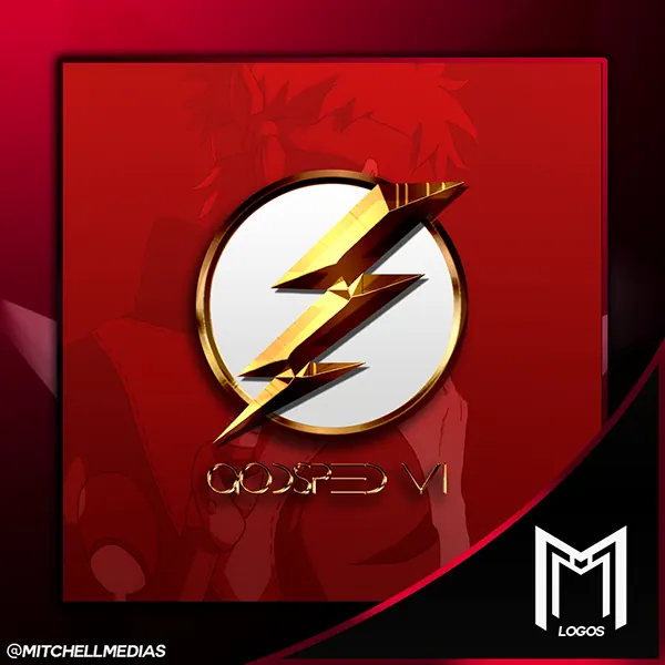
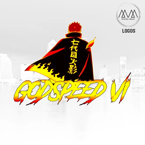
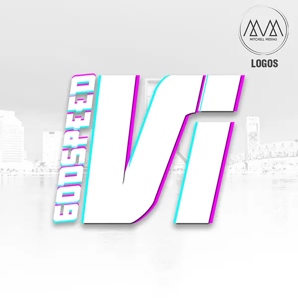
Three takes on one name: an emblem, a character lockup and a bold stacked wordmark, each built to carry the same speed and attitude.
Godspeed VI needed an identity with energy built in. It had to read instantly at small sizes, like a profile picture, and still have enough presence to lead a banner or a piece of merch.
We built the system around the idea of speed. The primary emblem is a gold lightning bolt cutting through a white disc, simple enough to recognize at a glance.
The character lockup pushes the energy further, with flame lettering paired with the client's signature artwork. A stacked VI wordmark with a split cyan and magenta edge gives a third option for loud, high-contrast uses.
- Primary lightning emblem
- Character lockup with flame lettering
- Stacked VI wordmark
Every version shares the name and the attitude, so the brand stays recognizable whichever one shows up.
Life at the River International Ministries
An ongoing content system for a church: weekly scripture posts, a giving series and event promotion that all look like one ministry.
Keep a steady, recognizable presence on social between Sundays, and promote events without every post looking like it came from a different place.
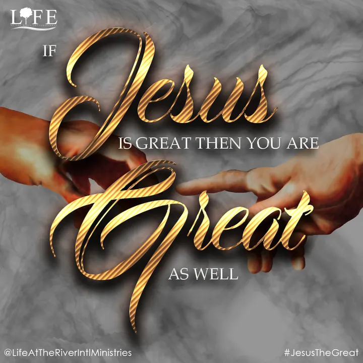
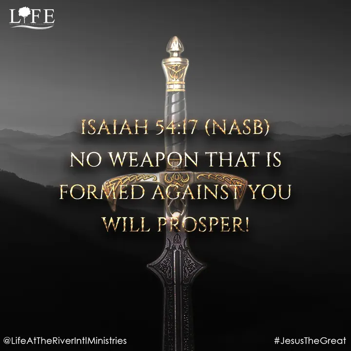
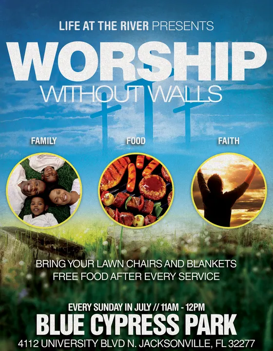
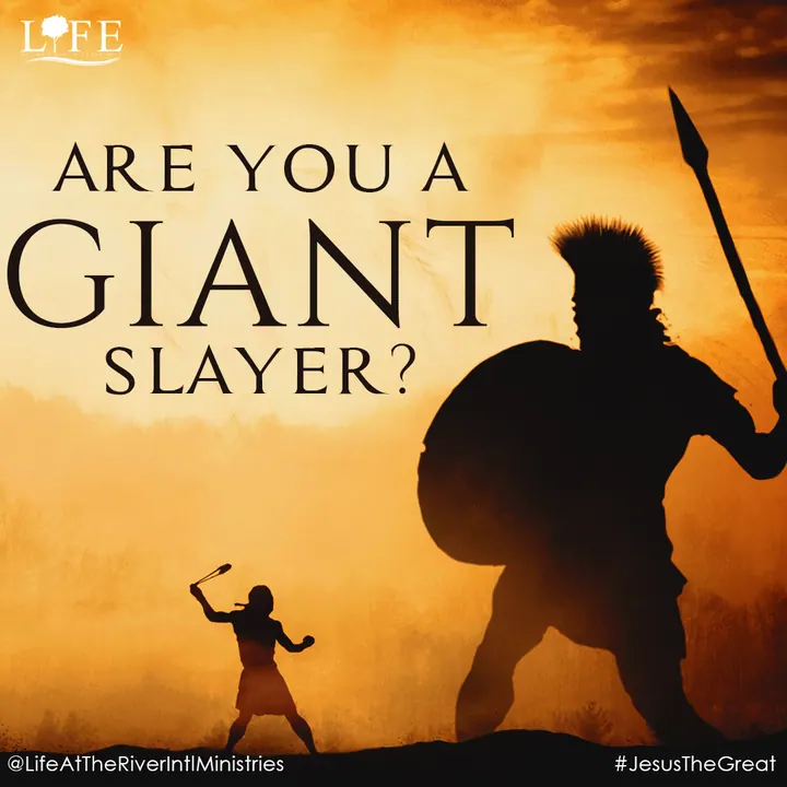
We set a consistent frame for the weekly #JesusTheGreat posts: a strong headline, cinematic photography and the LIFE mark in the same corner every time.
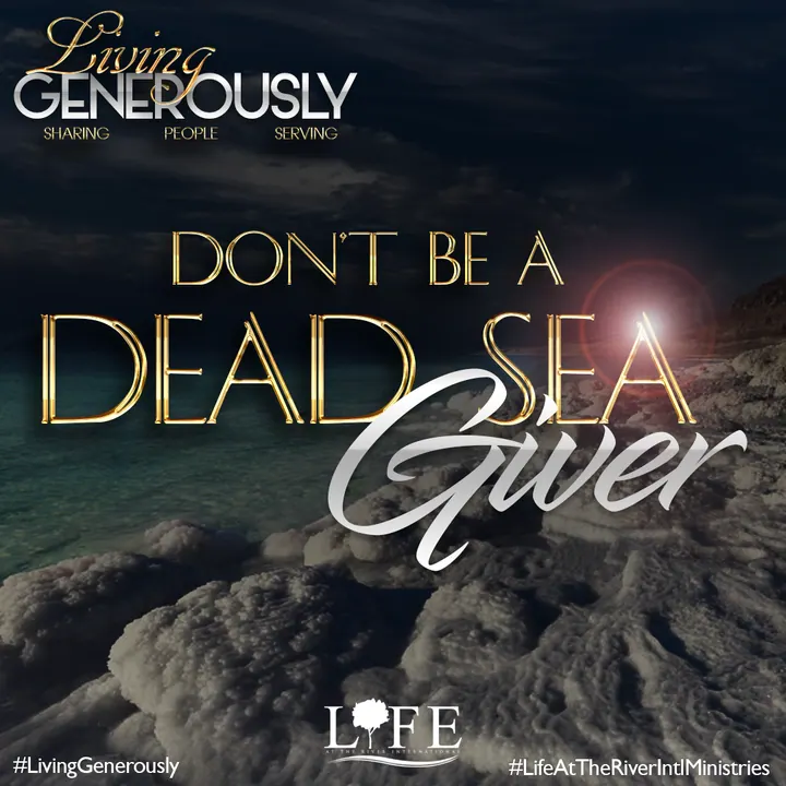
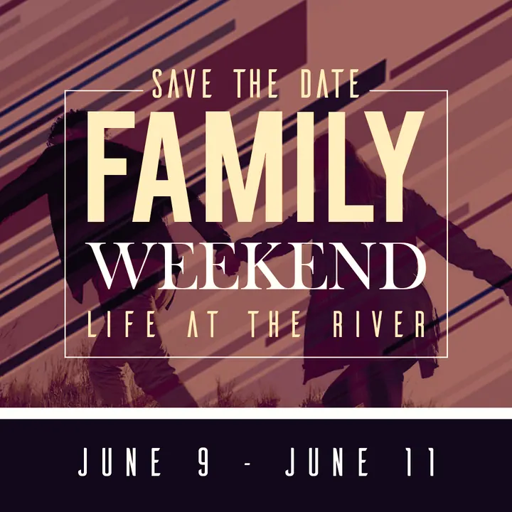
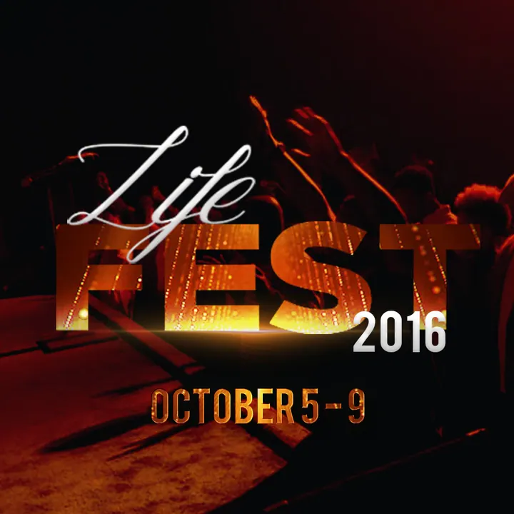
The Living Generously series got its own serif type and warm photography so it reads as a set. Event pieces like Family Weekend, Life Fest and Worship Without Walls carry the same type and logo placement into print and social.
- Weekly #JesusTheGreat scripture series
- Living Generously giving series
- Event promos for social
- Print flyers for services and outdoor worship
With one visual system behind every post, people can recognize a LIFE post in their feed before they read a word.

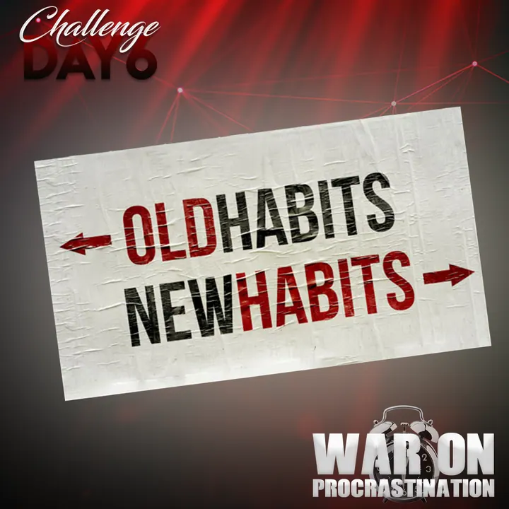
War On Procrastination
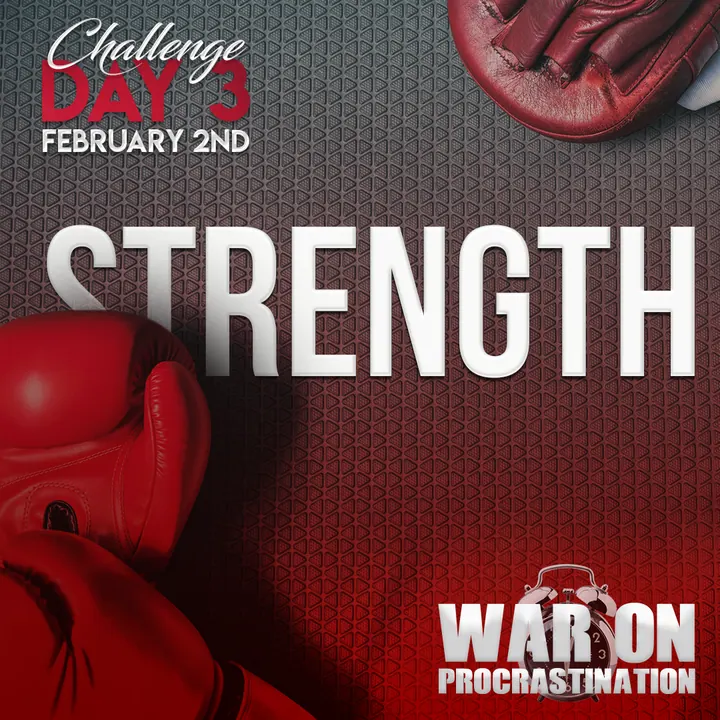
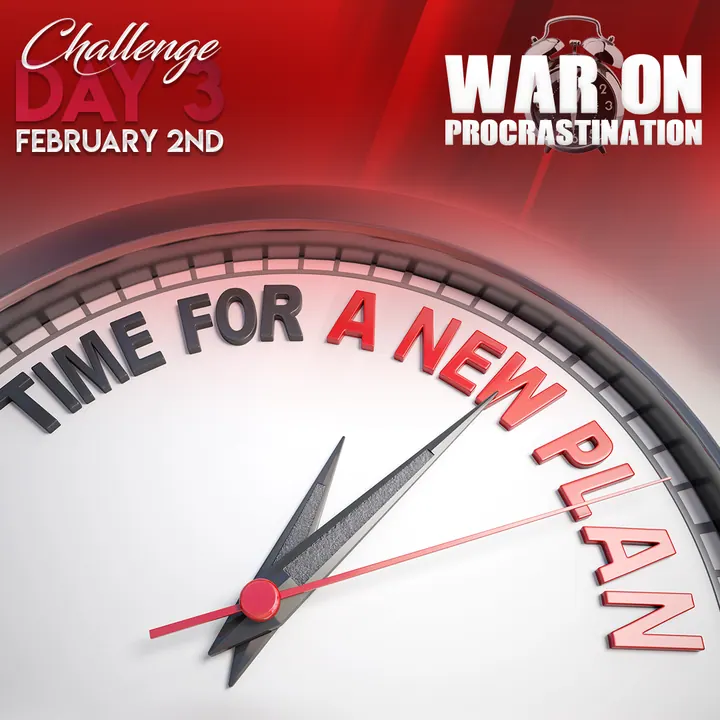
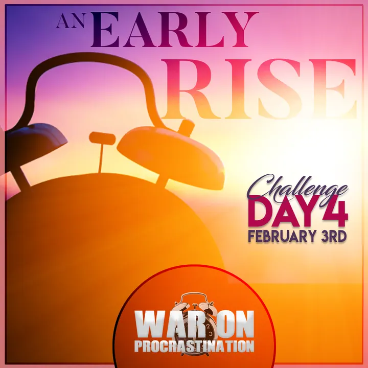
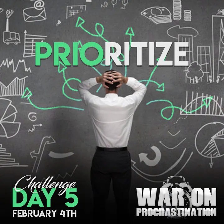
A multi-day challenge where each day gets its own post, tied together by one badge and a day counter you can't miss.
Get people to follow along day by day, and make it obvious which day of the challenge they're looking at.
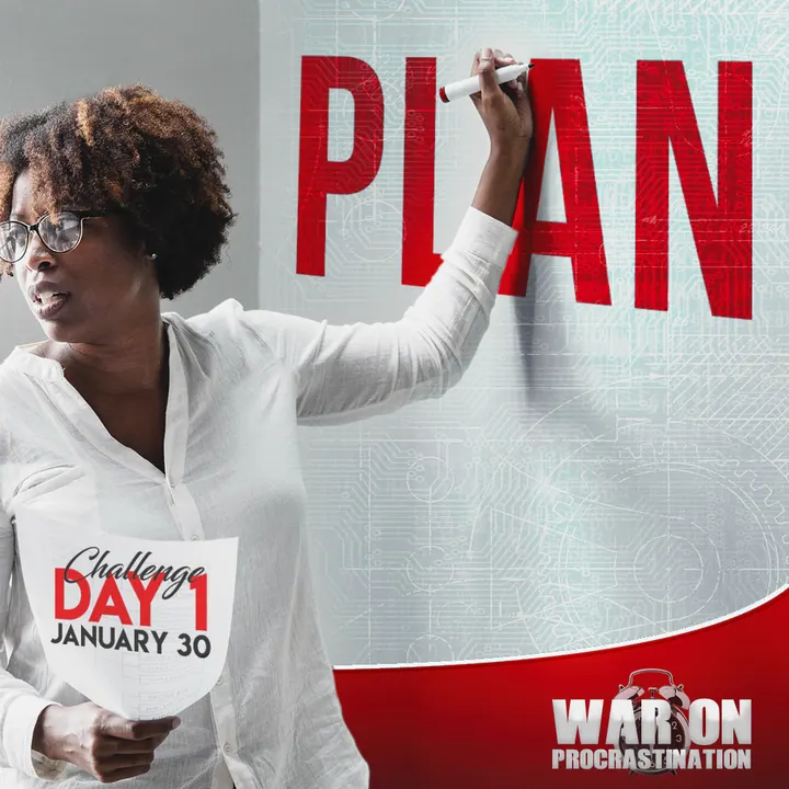
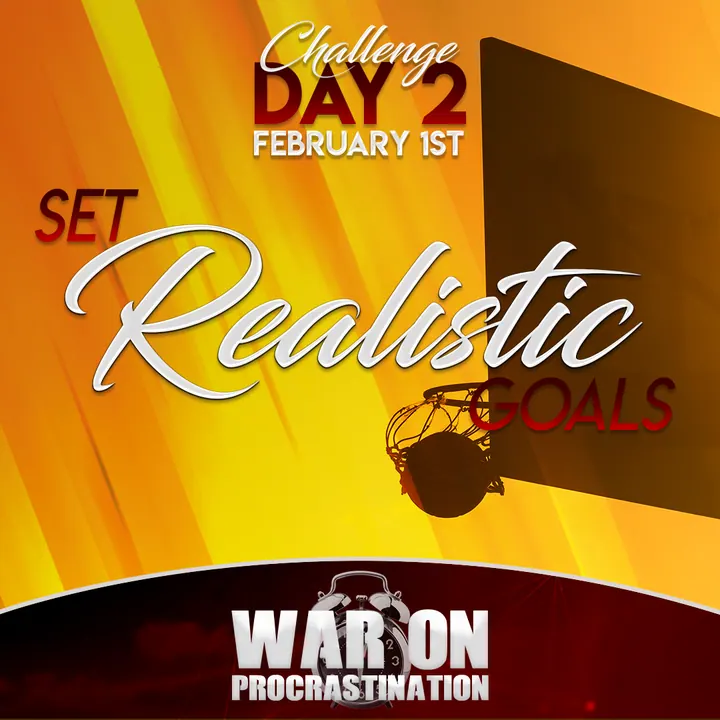
Every post leads with a large Challenge Day marker and the date, so followers always know where they are in the series.
Each day's theme, from making a plan to setting realistic goals, building strength, rising early and prioritizing, gets its own photo and color. The War On Procrastination badge sits in the same corner on every post to hold the campaign together.
- Daily challenge posts
- Campaign badge
- Day and date system used across the series
The repeating day marker and badge turn separate posts into a campaign people can follow from start to finish.
Start a mission with Void Visuals.
Tell us what you're building. We reply to every inquiry within two business days with next steps and a quote.